Teenage Mutant Ninja Turtles
A franchise style guide for Nickelodeon's rebooted Turtles
I loved every moment of this one.
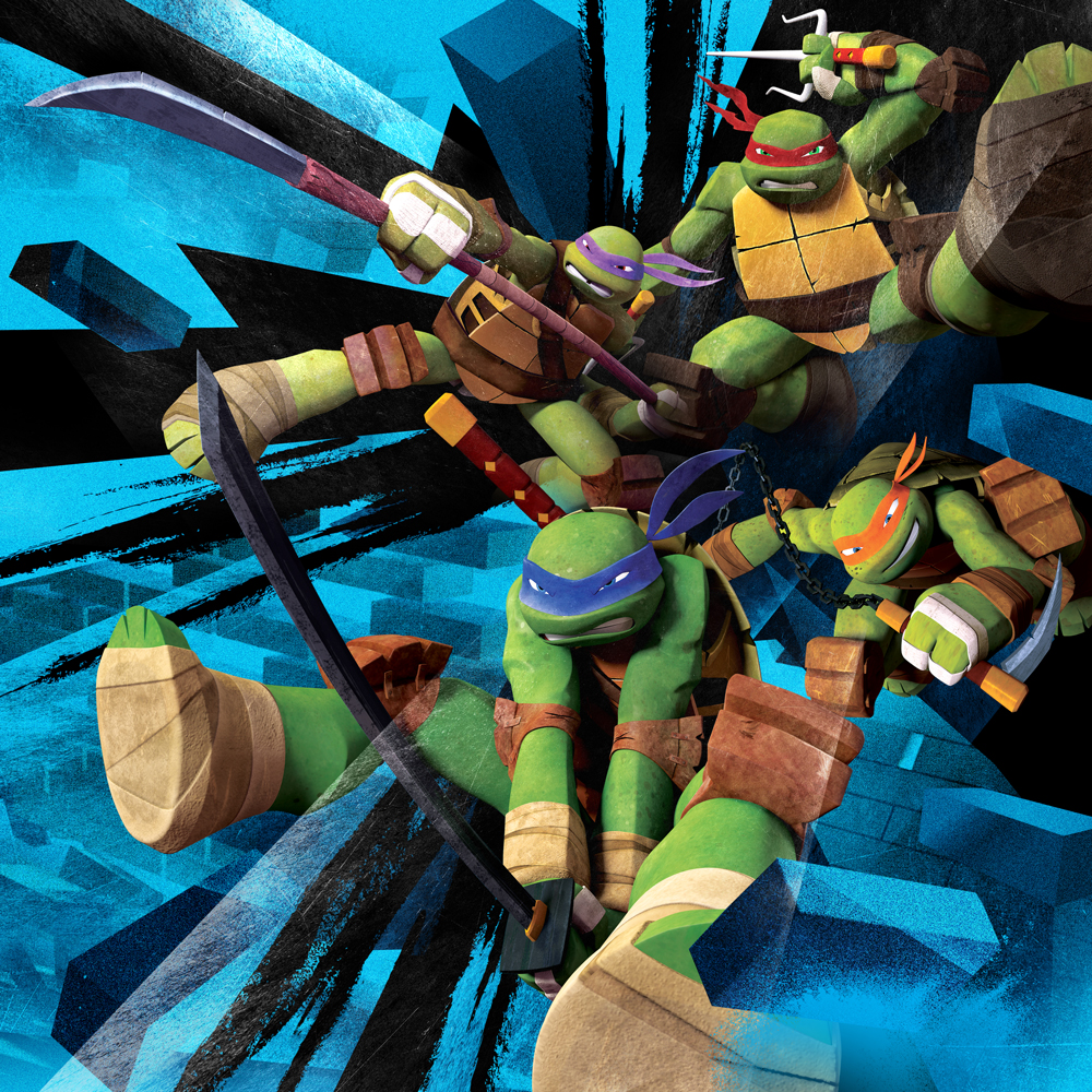
Nickelodeon was rebooting the Teenage Mutant Ninja Turtles: new character designs, a tightened storyline, and a version of the franchise built to land with a modern audience. They came to Struck, where I was designing at the time, for the style guide that would hold all of it together.
Almost two years later it was a book. Hundreds of illustrations, logos, icons, textures, backgrounds and product applications, specified closely enough that everything made from it would still look like the same franchise.
Led the visual approach and kept the system cohesive, with other Struck designers supporting.
The franchise reboot: redesigned characters, a tightened story, a modern audience.
From first character explorations to a finished, licensable book.
Illustrations, logos, icons, patches, patterns, textures, backgrounds, product applications.
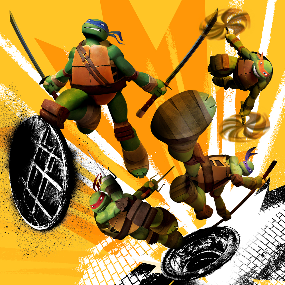
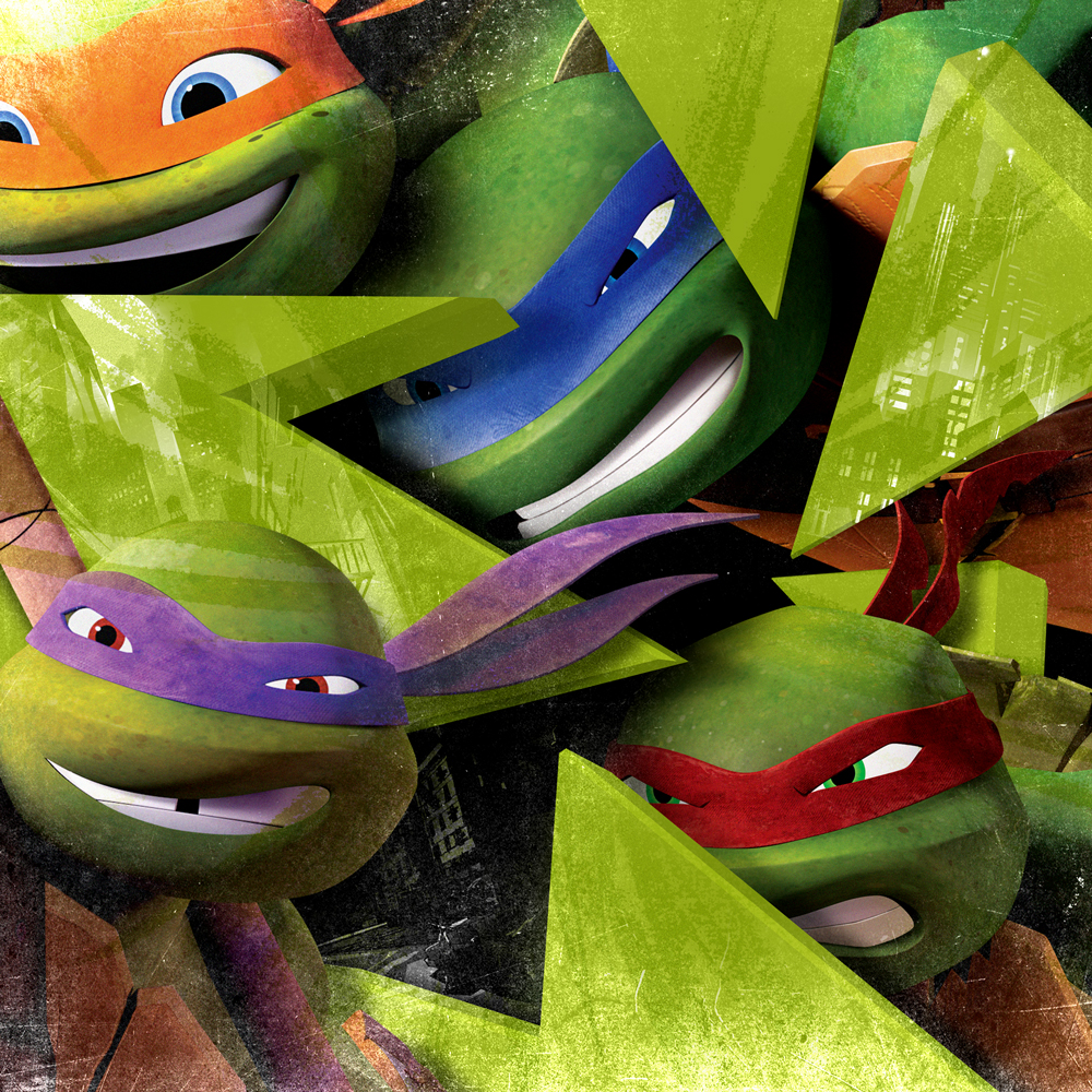
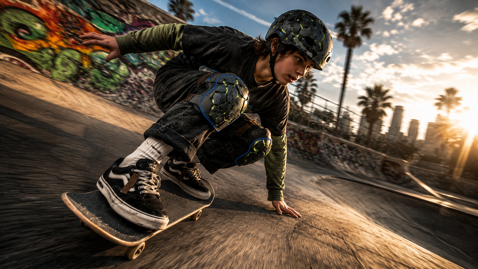
The direction was specific. The new Turtles had to feel urban and Asian-inspired with a skater-punk edge, and they had to work for children and teenagers at the same time. That second part is the difficult one, because the same mark has to read as fun on a lunchbox and credible on a skate deck.
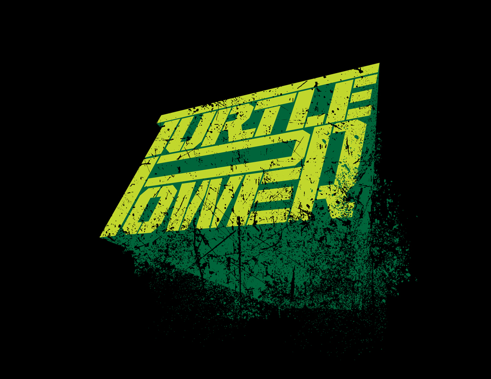
So the book had to carry every register: character art, logos and lockups, patches, patterns, textures, backgrounds, and the product applications that show how they all go together.
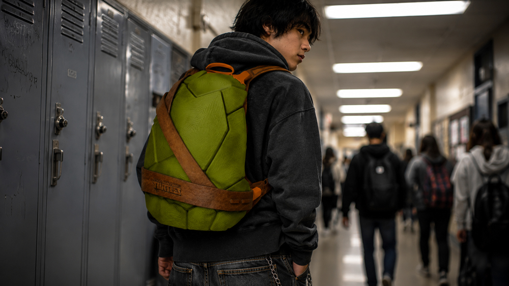
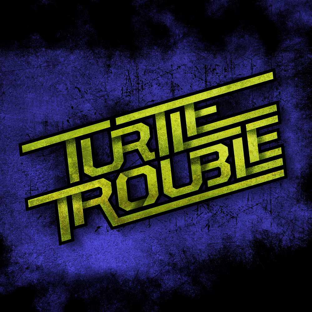
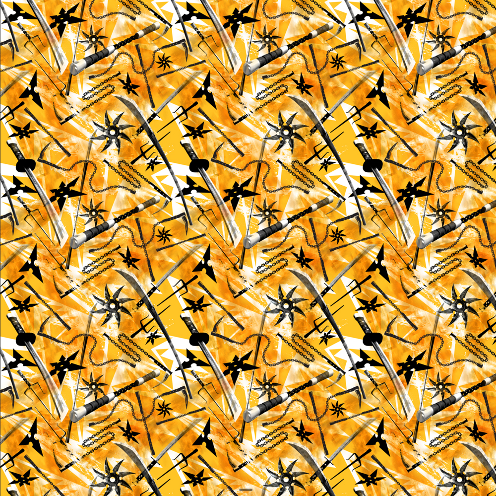
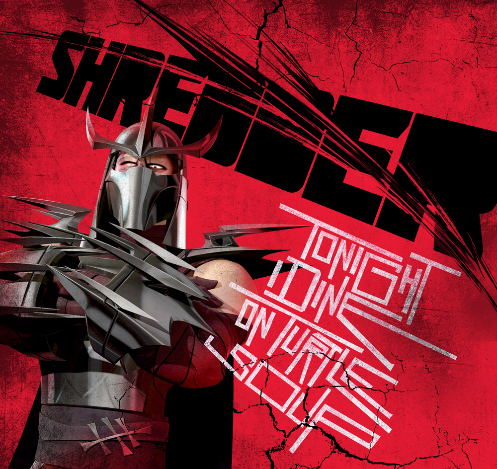
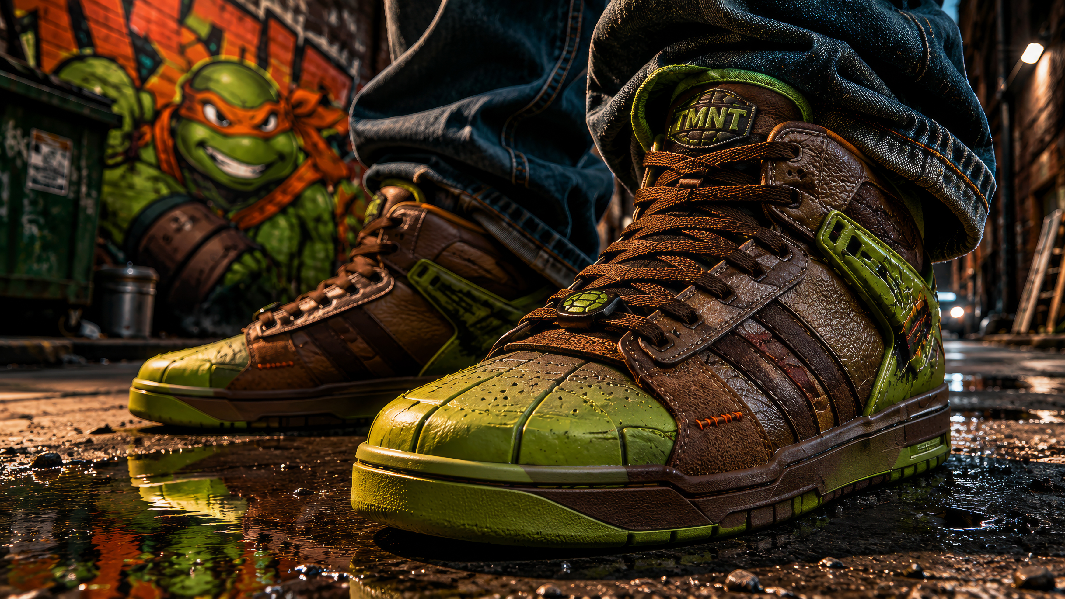
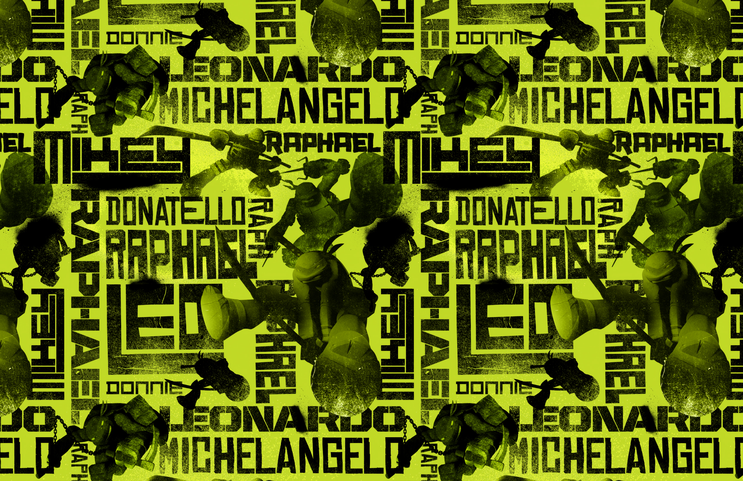

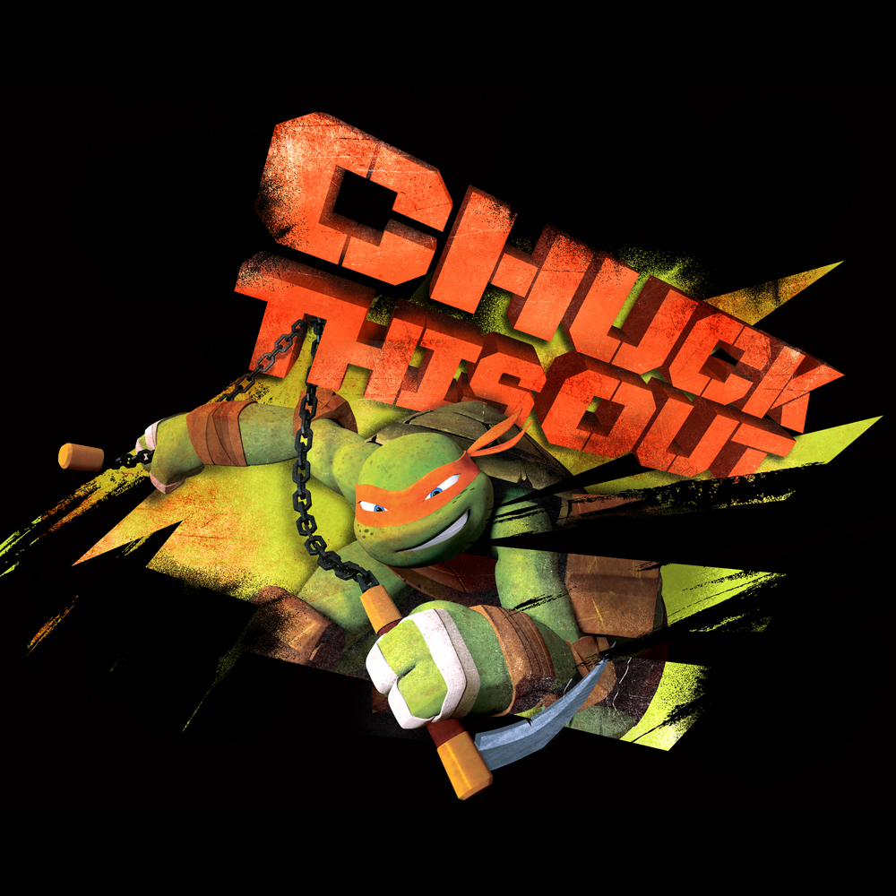
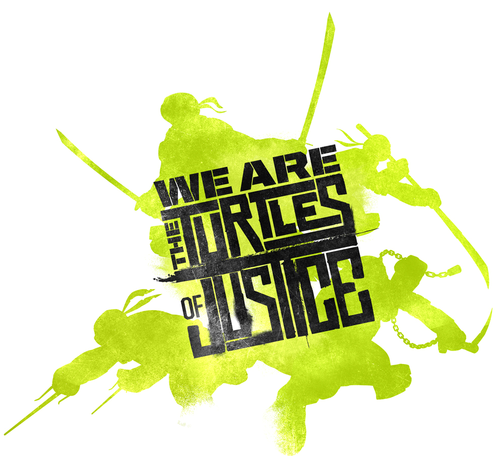

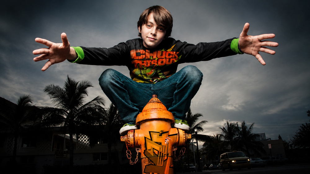
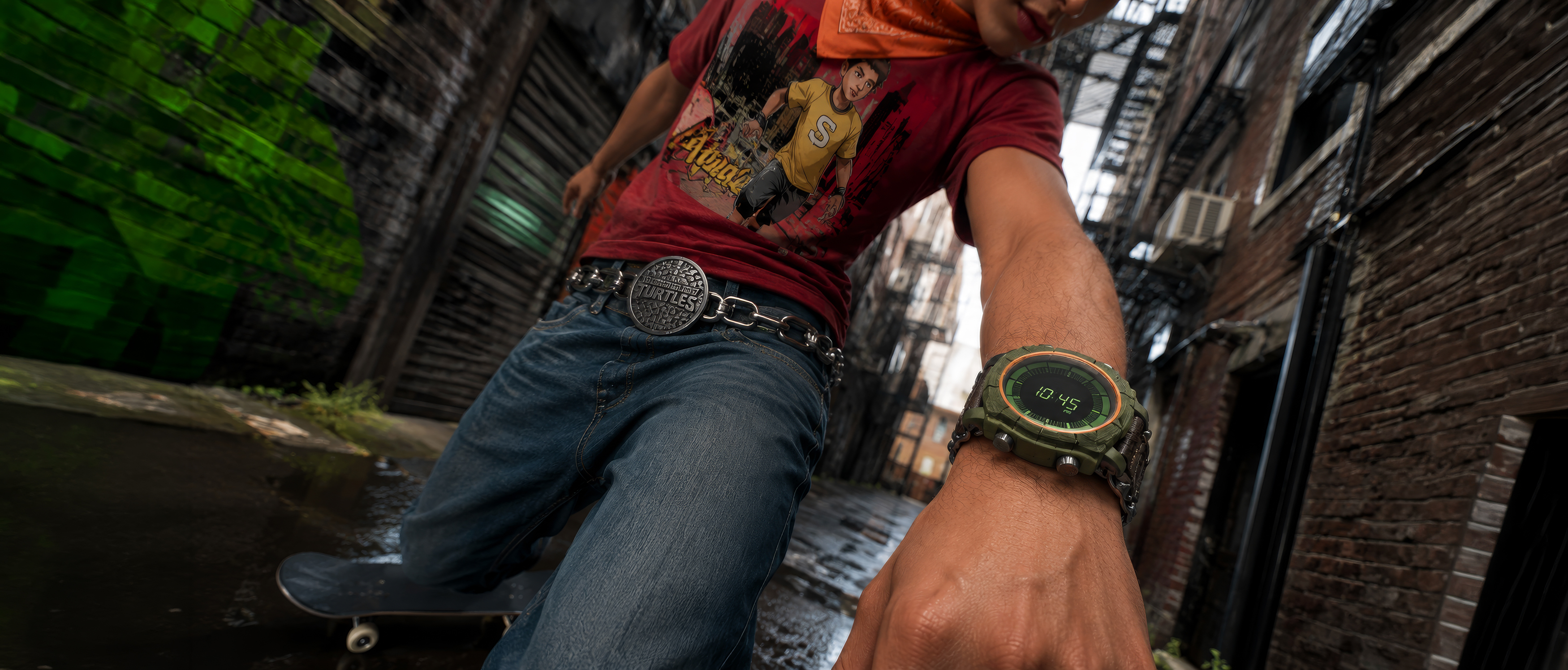
To this day I love walking through a Walmart and spotting a king-size bed sheet covered in the same illustrated sewage monsters I helped draw.
I'm still looking for an excuse to buy the children's Splinter portable potty. Maybe one day.